For this demonstration, I will focus on the relationship between height, weight, and blood pressure. I created a completely artificial data set for illustrative purposes. The demonstration uses Statsmodels and Python, your mileage may vary with other packages. First, let's import the relevant packages:
import pandas as pd
import numpy as np
import statsmodels.api as sm
from mpl_toolkits.mplot3d import Axes3D
from matplotlib import pyplot as plt
from pylab import rcParams
plt.ion()
The first thing I want do do is create the dataset. I am intentionally forcing height and weight to be correlated in order to demonstrate the performance of multiple regression on correlated data.
N = 100
xName1 = 'Height cm'
xName2 ='Weight kg'
yName = 'Blood Pressure (sys)'
df = pd.DataFrame(columns = [xName1, xName2, yName])
df[xName1] = [np.random.randint(140, 200) for i in range(N)]
df[xName2] = df[xName1]/2 + 8 * (np.random.randn(N)-0.5)
df[yName] = -1*df[xName1]+1.5*df[xName2] + 5*(np.random.randn(N)-0.5) + 160
X1 = df[xName1]
X2 = df[xName2]
XBoth = df[[xName1, xName2]]
y = df[yName]
Note that I initialize the first column, X1 (height) as a set of 100 random numbers from 140 to 200. The second column, X2 (weight) is the height divided by 2 plus some Gaussian noise. The final column, y (blood pressure) is created by applying the formula:
-1 * height + 1.5 * weight + noise + 160To show that the height and weight are correlated, I wrote a custom function, plot2D, which we'll use later.
def plot2D(model, dataX, dataY, color):
    xName = dataX.name
    yName = dataY.name
    params = [float(x) for x in model.params]
    intercept = params[0]
    slope = params[1]
    prediction = slope*dataX + intercept
    plt.plot(dataX, prediction, color)
    plt.scatter(dataX,dataY, color = 'k', facecolors='none')
    plt.xlabel(xName)
    plt.ylabel(yName)
    pvaldict = model.pvalues
    paramdict = model.params
    l1 = ['p_' + str(x) + ' = ' + str('{:0.0e}'.format(pvaldict[x])) + ' ' for x in pvaldict.keys() ]
    l2 = ['Coef_' + str(x) + ' = ' + str(round(paramdict[x],2)) + ' ' for x in paramdict.keys()]
    l3 = 'R^2 = ' + str(round(model.rsquared,3)) + ' f_p = ' + str('{:0.0e}'.format(model.f_pvalue))
    plt.title(' '.join(l1) + '\n' + ' '.join(l2) + '\n' + l3)
Then I created a two-variable regression model in statsmodels to predict the height from the weight and plot the regression line and data points using the above plot2D function:
modelcorr = sm.OLS(X2, sm.add_constant(X1)).fit()
plt.figure('Corr')
plot2D(modelcorr, X1, X2, 'gray')
plt.tight_layout()
plt.show()
Note that I have to add a constant to X1 in order to get a regression with an intercept. I obtain the following plot:
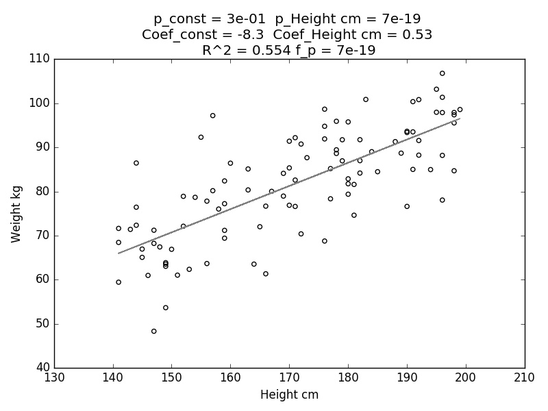
Note the high R^2 value (0.554) in the title. I created the 'weight' variable by diving 'height' by a constant and adding a bit of noise, so this is what we should expect. The p-value of the model (f_p) is also quite low, indicating that we can reject the null hypothesis that Height and Weight are uncorrelated. The coefficient of the regression that we obtained here (coeff_Height cm) is 0.53, which is very close to the coefficient we used when creating the weight from the height - as it should be. (For the moment, ignore the other variables on top, we'll get back to those.)
What we want to do now is see how Height and Weight affect blood pressure. First, we'll perform separate single regressions for Height vs. Blood pressure (model1) and Weight vs. Blood pressure (model2). Then we'll perform a multiple regression, predicting blood pressure from both weight and height together. To create the models:
model1 = sm.OLS(y, sm.add_constant(X1)).fit()
model2 = sm.OLS(y, sm.add_constant(X2)).fit()
model3 = sm.OLS(y, sm.add_constant(XBoth)).fit()
Now we want to visualize these models and look at their stats. We'll start with the single-variable models, model1 and model 2.
color1 = 'r'
color2 ='b'

fig = plt.figure('Demo', figsize = (24,15))
ax = fig.add_subplot(2, 3, 1)
plot2D(model1, X1, y, color1)

ax = fig.add_subplot(2, 3, 4)
plot2D(model2, X2, y, color2)
We obtain these plots:

Note that while we do observe some single-variable correlation between the Height vs. Blood Pressure and Weight vs. Blood Pressure, the R^2 here is relatively low (0.091 and 0.14, respectively).
Because our data is, in fact, 3-dimensional, I'll show the same data and regression lines on a 3-D plot. When we plot the regression lines on a 3-D plot, the lines will actually be planes which have a slope only in the direction of a single variable. To plot the 3D data, we'll need a new function.
def plot3D(ax, model, dataX1, dataX2, dataY, coeffs, color):
    xName1 = dataX1.name
    xName2 = dataX2.name
    yName = dataY.name
    meshx = np.linspace(min(dataX1),max(dataX1),55)
    meshy = np.linspace(min(dataX2),max(dataX2),55)
    X,Y = np.meshgrid(meshx,meshy)
    Z = coeffs[0] + coeffs[1]*X +  + coeffs[2]*Y
    ax.plot_surface(X, Y, Z, color = color, alpha = 0.75)
    ax.scatter3D(dataX1, dataX2, dataY, color = 'black')
    ax.set_xlabel(xName1)
    ax.set_ylabel(xName2)
    ax.set_zlabel(yName)
    pvaldict = model.pvalues
    paramdict = model.params
    l1 = ['p_' + str(x) + ' = ' + str('{:0.0e}'.format(pvaldict[x])) + ' ' for x in pvaldict.keys() ]
    l2 = ['Coef_' + str(x) + ' = ' + str(round(paramdict[x],2)) + ' ' for x in paramdict.keys()]
    l3 = 'R^2 = ' + str(round(model.rsquared,3)) + ' f_p = ' + str('{:0.0e}'.format(model.f_pvalue))
    plt.title(' '.join(l1) + '\n' + ' '.join(l2) + '\n' + l3, y=1.08)
In addition to taking the model itself as a parameter, we need to specify the coefficients of the plane in 3-D space, because the 2-D models (model1 and model2) will only give us coefficients in 2 dimensions; we need to add a 0 to create a slope in the missing dimension. So we have:
coeffs1 = [model1.params[0], model1.params[1], 0]
coeffs2 = [model2.params[0], 0, model2.params[1]]
coeffs3 = [model3.params[0], model3.params[1], model3.params[2]]
Finally, we plot model1 and model2 in 3D space:
ax = fig.add_subplot(2, 3, 2, projection='3d')
plot3D(ax, model1, X1, X2, y, coeffs1, color1)

ax = fig.add_subplot(2, 3, 5, projection='3d')
plot3D(ax, model2, X1, X2, y, coeffs2, color2)
And we obtain:

Finally, the multivariate regression:
ax = fig.add_subplot(2, 3, 3, projection='3d')
plot3D(ax, model3, X1, X2, y, coeffs3, 'green')

ax = fig.add_subplot(2, 3, 6, projection='3d')
plot3D(ax, model1, X1, X2, y, coeffs1, color1)
plot3D(ax, model2, X1, X2, y, coeffs2, color2)
plot3D(ax, model3, X1, X2, y, coeffs3, 'green')
plt.tight_layout()
plt.show()
And we obtain:

The top plot shows the prediction of the multivariate regression by itself, the bottom plot shows the multivariate prediction overlayed with the two single-variable predictions from the graphs above. Note, first of all, that the multivariate prediction is *very* different than each of the single variable predictions. Because the mutlivariate model can cave a slope in both the 'Weight' and 'Height' directions, the model that minimizes the mean squared error (MSE) with two variables gives us a drastically different fit than a model that uses only a single variable. Also note the R^2 here: 0.89, very close to a perfect fit. And, incredibly, the coefficients obtained for the prediction are almost the same as the coefficients we used when producing our data! When we originally made our data, we created it with an intercept of 160, a coefficient for height of -1, and a coefficient for weight of +1.5. The multiple regression model predicts these on the nose (intercept: 161.73, height: -0.99, weight: 1.42) despite the fact that the two independent variables were initially correlated with an R^2 of 0.55! Of course, when you have correlated independent variables the results won't always be this good, because multicolinearity is still a concern for multiple regression, but this model did a very good job despite the high correlation between height and weight.
No comments:
Post a Comment